Branding / UX / Design Systems
Let the world see different options.
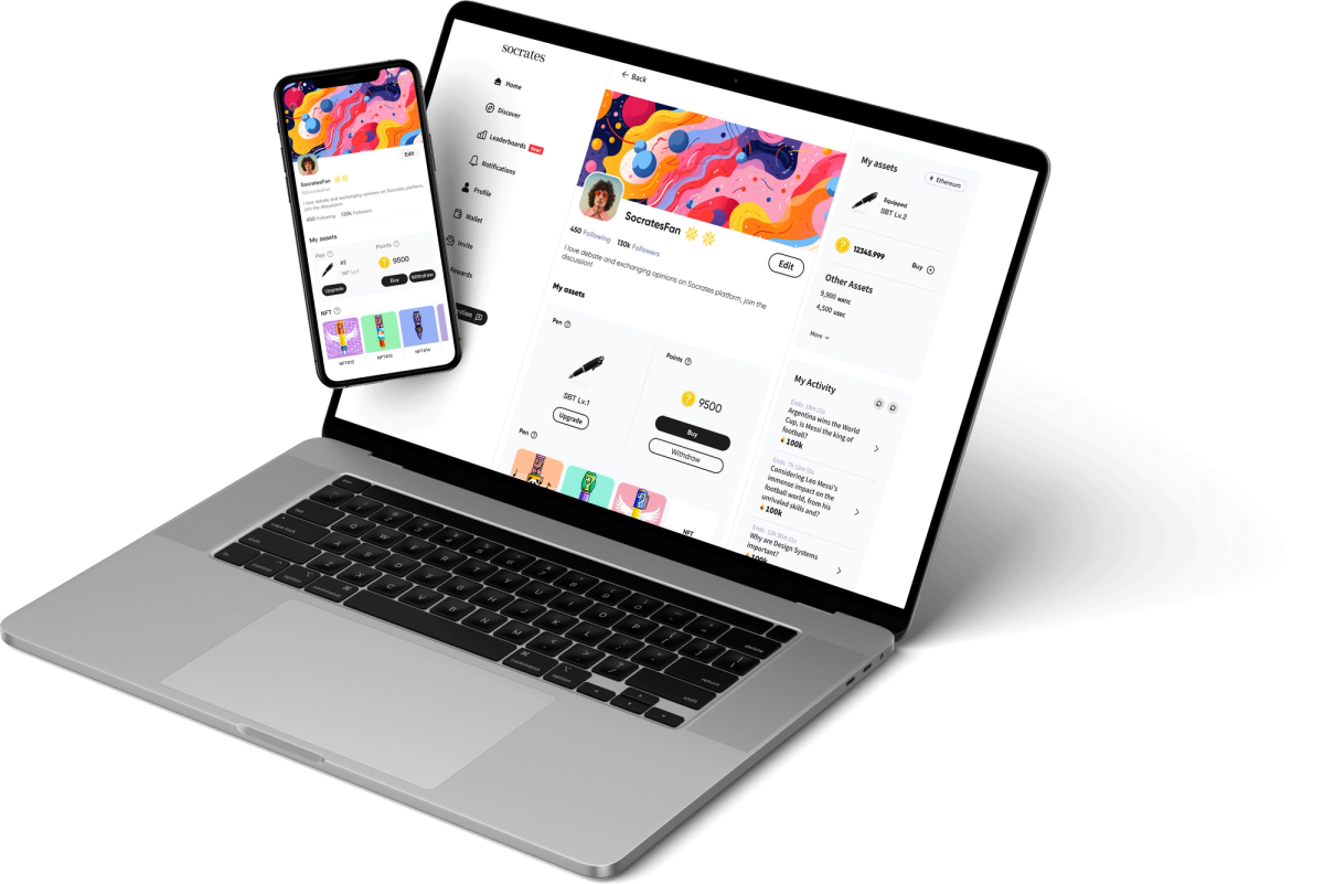
Socrates is a web3 social media platform that flips the traditional model — rewarding users directly for the content they create rather than selling their data to advertisers. Built around gamification, competition, and community, users earn real currency through questions, debates, and battles.
Joining as the most senior designer during a fast-paced startup phase, with the CEO's trust from day one, the role covered everything from rebuilding the design system and establishing team processes, to shaping the product's creative vision and formalising the brand identity — and never had a dull moment.
In today’s world where users’ data is the currency social media works and sustain their businesses, having a new competitor removing that price and replacing it with a reward and incentive system for users to actually make a profit out of their content, this was destined to have an impact.
Brand, internal processes, design systems and vision
Due to the nature of the role and the type of company, my responsibilities were many and varied, going from fundamental branding/vision areas to more advanced and structural parts such as creating collaboration and design processes for the design team to implement.
Also, being the most senior of our designers, I took on a mentoring role and helped the team shaping structures and creative workflows for internal delivery and collaboration that will ensure quality of work being delivered without having to complicate things or do unnecessary work.
For example, one of my initial tasks was to take their logotype, help refine it and make a professional brand identity guidelines document out of it since they didn’t have a proper one.

To problems, solutions
Challenge
Implement a design culture and collaboration processes
Solution
The design system was audited and rebuilt using a token-based variable structure, aligning design with development and eliminating inconsistencies across mobile and web. Collaboration documents and component submission processes were introduced to give the team a clear, repeatable workflow.
Challenge
UI design optimisation
Solution
A card-based UI replaced the cluttered home feed, using progressive disclosure to show information only when users engage. Labels were reduced, imagery given more prominence, and prototypes built to communicate the improvements to the wider team.
Challenge
Vision and creativity
Solution
A series of prototypes introduced card-based question components with swipe interactions and multiple media types. An AI image generation system was designed to automatically produce contextually relevant visuals based on post content, reducing friction while maintaining visual consistency.
Challenge
Lack of brand cohesion and identity
Solution
A full brand identity system was created covering logo usage, colour, typography, and tone of voice, alongside a dedicated design guidelines platform. Physical brand touchpoints — business cards, lanyards, merch, and a redesigned website — brought the identity into the real world.
Joining Socrates as the most senior designer, the process spanned the full design lifecycle — from foundational work to product vision.

Figma
For design system, UI and prototyping.

Principle
For advance prototyping and micro interactions

Responsive design
Across web and mobile (iOS/Android)
It began with a thorough audit of the existing design system and team workflows, identifying gaps in consistency and collaboration. From there, the focus shifted to rebuilding the system with a scalable, token-based approach while introducing clear processes for the team to follow.
In parallel, the product UI was evaluated and optimised through iterative prototyping, reducing complexity and improving the user experience across both mobile and web platforms. Beyond the functional, the role extended into creative exploration — pushing the product's visual direction forward with new interaction concepts and an AI-powered image generation feature.
Finally, the brand identity was formalised end-to-end, from guidelines and tone of voice through to physical merchandise and a redesigned website, ensuring Socrates presented a cohesive and recognisable identity across every touchpoint.
Things I helped the team achieve
Full
brand identity system created from zero
2 platforms
Unified under the same design system
Implemented
New collaboration and design frameworks
2 libraries
Build up from scratch
2 guides
Brand identity and Design guidelines site
Like what you see?
Let’s get involved in your next great project, drop me a line below.
Or scroll down to continue reading more details about this project.
Implementing a new way of working
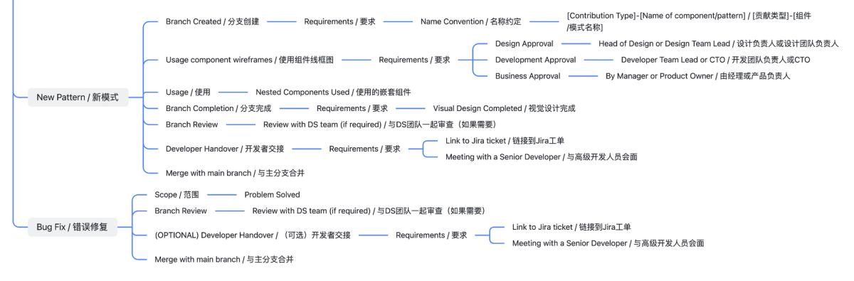
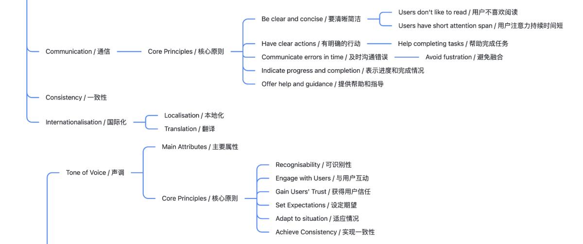
Having a clear collaboration process within a design team is essential for maintaining consistency and quality at scale. Starting from the ground up, a series of forms and documents were created covering the full design workflow: how designers collaborate day to day, how work moves through the delivery pipeline, and how new components and patterns are proposed and reviewed before making it into the central design system.
One example of this is the new pattern submission process (pictured below), a structured mind map outlining exactly how interaction patterns are evaluated and approved for inclusion into the system. This kind of documentation removes ambiguity, keeps standards high, and ensures the design system grows in a controlled and intentional way.
A token based design system to rule them all
Following a full UI and component audit, the entire component library was rebuilt from scratch using a scalable, token-based variable architecture — the same approach used by the development team in code. A two-tier library structure separated primitive values (colours, spacing) from semantic tokens, ensuring no hardcoded values existed anywhere in the system and creating a direct, one-to-one alignment between design and development.
The result was a system built for change — theme updates that previously required touching hundreds of components could be made in seconds, dramatically reducing refactoring time and giving both designers and developers a single source of truth to work from.

The magic of variables
Adopting a token-based design system is something I’ve seen many teams avoid — often due to time pressures or uncertainty around implementation. But the benefits are too significant to ignore, and it's become a non-negotiable part of the design process on every new project.
Getting the team on board was straightforward once they could see it in action. A short demo was recorded showing just how fast themes could be created and edited when variables are structured correctly — seeing it working in real time was all it took to get everyone aligned. Sometimes the most effective way to advocate for better ways of working is simply to show them.
Themed components
The product supported both light and dark themes, but inconsistencies in how they were applied had crept in across the component library. The token-based colour variable system proved invaluable here, making it straightforward to identify and resolve those inconsistencies at source rather than fixing them screen by screen.
Every component was rebuilt with a full set of properties, giving designers the flexibility to drop them into any context and customise them without breaking the system. The result was a library that was not only visually consistent across both themes, but genuinely easy to use.
Example: Input component
Input components would include differente properties for better customisation:
- Platform (Mobile, web)
- State (Focus-filled, focus, filled, not filled)
- Disabled (On / Off)
- Has label (On / Off)
- Label text
- Filled content
- Hint text
- Error/Hint? (Yes / No)
- Has action (Yes / No)
- …and more

Information overload
The UI audit revealed opportunities for improvement at every level — from individual components through to full user flows. The most significant issue was information overload: too much displayed at once, with elements that could have been tucked into secondary interactions keeping the interface cluttered and the cognitive load unnecessarily high.
Recommendations were presented to the product and development team throughout, backed by prototypes and demos wherever a written suggestion wasn't enough. Showing a solution visually is almost always more persuasive than describing it, and it helped move the right ideas into development faster.
Old Home
The original homepage displayed questions with all their information visible upfront — an approach that created unnecessary noise for users who had no interest in a given question. Labels were also overused throughout, adding visual weight to elements that most users would instinctively recognise from an icon alone.

New Home
Replacing questions with cards introduced progressive disclosure — full detail only revealed when a user chooses to engage, reducing visual clutter and cognitive load. Labels gave way to recognisable icons, imagery took centre stage, and the feed became significantly cleaner and more engaging as a result.

Putting the art in smart
The product needed a stronger creative vision — more considered UI design and more innovative thinking about how users could interact with content. A series of design explorations and prototypes were developed and presented to stakeholders, with several making it through to development.
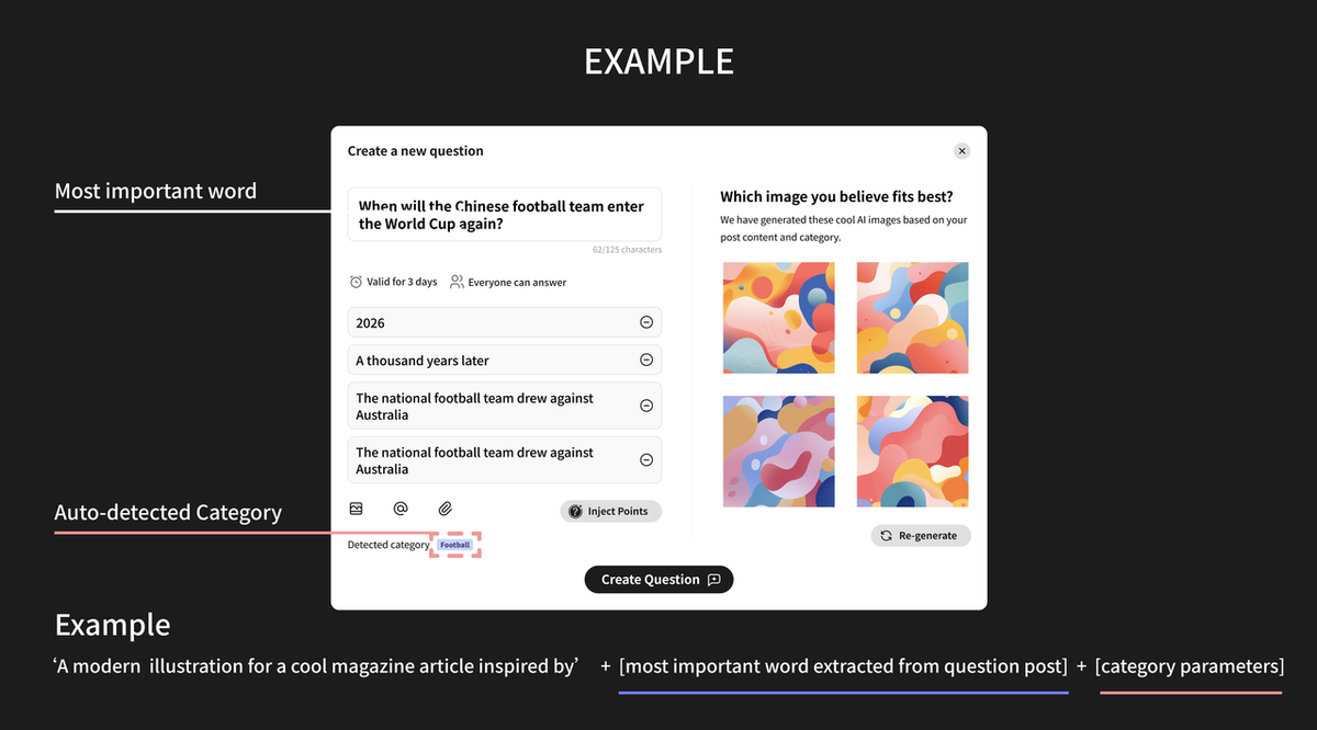
One of the most impactful was transforming the question component into an image card, using native mobile card interactions to make the experience more intuitive and engaging. Alongside this, an AI image generation feature was conceived — automatically producing contextually relevant visuals for each question based on its content, removing friction for users while giving every post a more compelling visual identity.
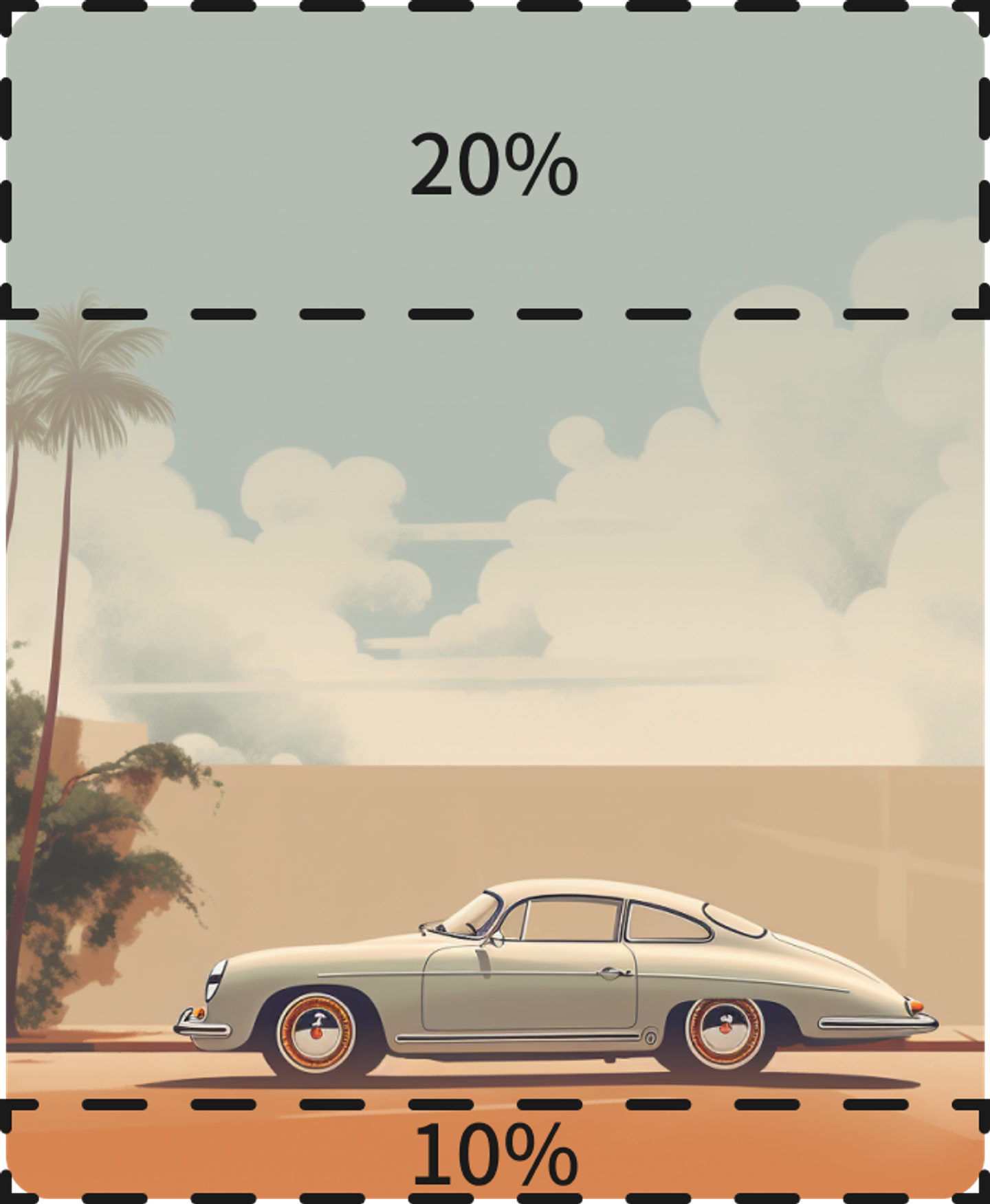
STEP 1
Smart back-end analyses the image colours. Chooses the most common colour in the top 20% of the image. Chooses the most common colour in the bottom 10% of the image.
Adding bliss through interactivity
To bring new concepts to life and get stakeholder buy-in, a series of interactive prototypes were built exploring new ways users could engage with content — from swipeable card stacks to carousels and expandable question threads. Seeing an idea in motion is always more convincing than a static frame.
Lack of brand cohesion and identity
A logo is just the starting point. Real brand identity is about creating a visual language so consistent and recognisable that it communicates who you are without a single word.
To help Socrates reach that level of cohesion, a full suite of merchandise and stationery was designed to carry the brand into physical spaces and new environments. The official website was also redesigned from the ground up, bringing it in line with current design standards and giving the brand a digital presence worthy of its ambition.

Design guidelines and foundations website
To embed a genuine design culture within the team, a comprehensive internal design guidelines platform was built covering everything from foundational design principles and brand guidelines to Figma project setup, meeting frameworks, and collaboration processes. The platform was named Plato — a fitting choice, given that Plato was Socrates' pupil and the reason his teachings survived to the present day. Just as Plato preserved and spread Socrates' ideas, this platform was built to preserve and spread the design principles that would guide the team's work going forward.
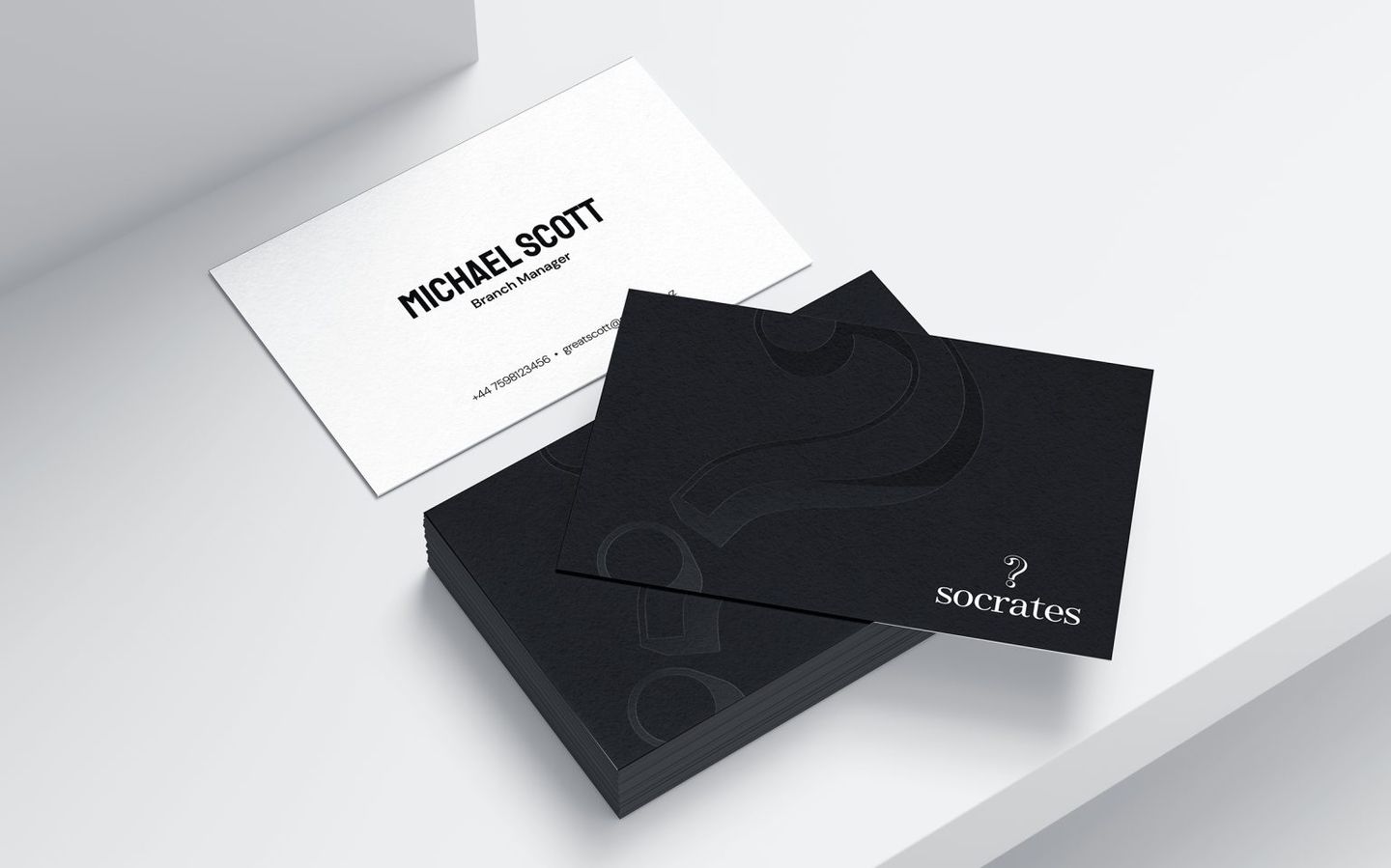
Business cards
Simple but effective card design using 200gsm stock card with UV treatment to show the ? logo reflection.