DESIGN SYSTEMS / PROTOTYPING / UX
Blackswan for Easyjet
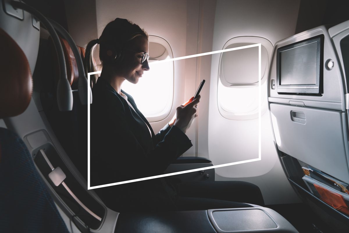
An intuitive and reliable POS system – designed collaboratively with the crew community -allowing frictionless sales and payments, promotions automation, and merchandising opportunities.
The one thing that I enoyed the most of this project was the ability to work with a platfrom that used real data analysis to make decisions and improve the user experience based on our designs. It showed me the importance not only from acquiring valuable data but also find a way to make the best use for it in a user-centered philosphy.
ONBOARD RETAIL FRAMEWORK
Original retail device for passenger & crew, ground and air server. - Passenger adoption engagement - Increase spend by % increase transaction
Designing at 30,000 feet
Leading UX, UI, and prototyping across the full product — from passenger-facing shopping flows and crew control tools to post-flight analytics dashboards. A key part of the role was testing designs with real users on live EasyJet flights, using those insights to iterate on interactions, refine checkout flows, and reduce friction at every touchpoint.

Turbulence ahead
This platform would be a simple and effective solution using latest wifi technology and retail and behavioural data analysis to create a POS experience in cabin to cater food and other items to passengerds during their flight.
Challenge
Handling orders in a constrained environment
Solution
Limited crew and cabin space made managing passenger orders slow and frustrating. A real-time POS system gave crew full control over orders, promotions, and shop status from a single interface — keeping service moving without added complexity.
Challenge
Making checkout frictionless
Solution
Any friction in the checkout flow meant lost sales. Through extensive testing on real flights with real users, the flow was continuously refined until seat delivery, deal building, and payment felt effortless.
Challenge
Designing for every screen
Solution
The platform needed to work across all passenger and crew devices. A 5-breakpoint responsive system ensured layouts and interactions were optimised for every screen size without compromising the experience.
Challenge
Turning flight data into better decisions
Solution
Post-flight insights had no clear way to be acted on. A behavioural data dashboard was designed to surface purchase and interaction analytics visually, helping decision makers improve the experience flight by flight.
Tested at altitude
Research and stakeholder alignment shaped the foundations, before moving into iterative design and early prototyping. Ideas were then validated with real users on live EasyJet flights — ensuring every decision, from user flows to micro-interactions, was grounded in real behaviour rather than assumption.

Figma
UI design, component building, and user flow prototyping

Principle
High-fidelity micro-interaction and gesture-based prototyping

Live flight testing
Real user testing environment during research and development phase
An industry first
The first time anywhere in the world passengers could access a full onboard retail offering from their own personal device.
0%
Downtime
5
Breakpoints
12
core features
89%
Prediction accuracy
Real flight testing
Worked with real users on live EasyJet routes
Like what you see?
Let’s get involved in your next great project, drop me a line below.
Or scroll down to continue reading more details about this project.
How does it work?
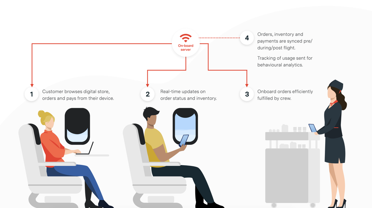
An on-board server will syncronise all the data, information and transactions with the crew and passenger devices creating a local wireless network.
Each flight has up to two servers to ensure full connectivity and 0% downtime during the whole duration of the flight, we tested this in real flights with EasyJet with success during the research, design and development phase.
Crew is in control
Thanks to real time connectivity and data analysis, the crew members have absolute control over what’s being displayed and promoted in the app with real time statistics and access to a control panel that can make changes on the fly for things related to restrictions, shop status, offers, etc…

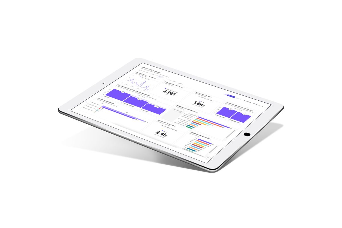
Post-flight analytics and behavioural data dashboard.
Once a flight is over, the server in-flight information would be syncronised with the airline’s database and all purchase, navigation and interaction information would be analysed and displayed in a dashboard using effective and clear infographics heping business’ decision makers to make any adaptations for the next flight/day.
A responsive experience.
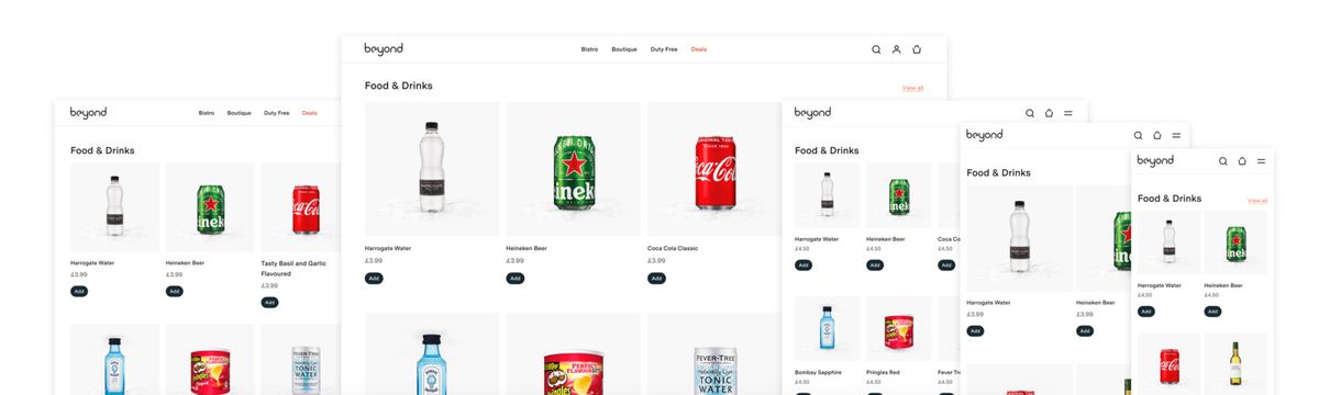
We wanted passengers to have the best experience regardless of what device they are using or even which operative system they run in.
All layouts and pages were optimised for the best visualisation and user experience, serving users the best interface their screens can accommodate.
We used a 5 breakpoint system to achieve the best results even in the rarest of screen sizes and resolutions.
From idea to interaction
For this project we focused on prototyping ideas internally early during conceptualisation phase, but we also carried out tests with real users when required a more data informed decision.
We used Figma and Principle as main prototyping tools, Figma for more userflow basic prototypes and Principle when we required extra finesse in creating delightful micro-interactions or testing out patterns that were more gesture based.
Here are some exmples of them.
The details that delight
Three core flows were prototyped and tested on live EasyJet flights — building custom deals, checking out with seat delivery, and booking onward travel like train tickets or hotels before landing. Each flow was tested with real users in the air, allowing pain points to be identified and iterated on quickly, with a particular focus on keeping checkout as frictionless as possible to reduce abandonment and increase sales.
Main navigation menu
As one example of some of the interaction tests we performed, is the main menu navigation panel.
We wanted to keep things simple and familiar to the user but also add some extra details that will make it pleasant to use.
We tested different styles and methods of closing the menu for example that can be seen below.
Product detail page
Another aspect that I tested was how the main CTA of the product detail view would behave and show depending on users’ actions.
Some of the ideas I tested were playing with the positioning of the button when scrolling through content.
Desktop navigation and search
Having a responsive application requires adapt solutions to different sizes and interaction methods, as an example, here’s a small demo of how the navigation and search would work on desktop.