UX / UI / PROTOTYPING / DESIGNOPS
AMV-OS
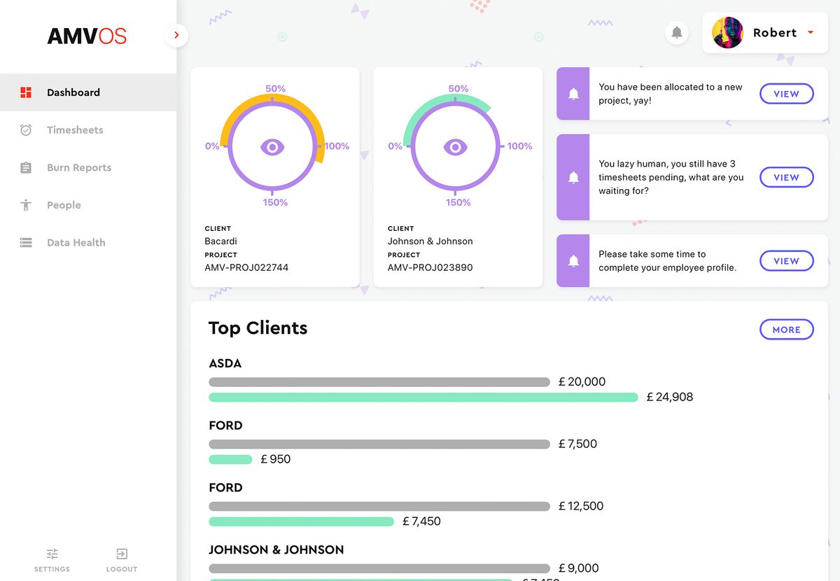
AMV/OS is an internal operating system built to unify the tools and processes of a large agency — AMV BBDO.
The company had been relying on multiple expensive third-party services running in isolation, with no way for departments to share data or work in a connected way.
A single back-end developer had been building a solution for a year, but without a designer the product had significant structural and usability gaps.
The goal was to turn that foundation into a coherent, scalable platform that could serve multiple departments from a single unified space.
Consultant designer on a solo mission
Brought in as an external design consultant to assess, restructure, and advance the internal tool that had been in development.
Working as the sole designer on the project, the role covered the full UX spectrum — from auditing the existing system and mapping information architecture, through to defining user journeys, designing UI components, and producing prototypes to gain stakeholder buy-in.
The engagement concluded with a full handover of UX documentation and screen designs for the internal team to continue building from.

Challenge
A product built without a designer
Solution
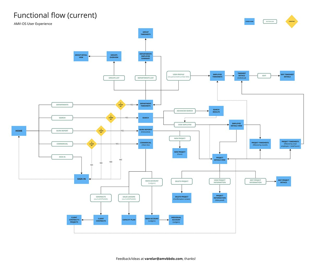
Before any new design work began, a full audit of the existing functional flow and sitemap was conducted to surface every gap and inconsistency in the system. This gave the team a clear picture of what needed fixing and in what order, creating a solid foundation to build from rather than designing over underlying structural problems. The first step was a full audit of the functional flow and sitemap to surface every gap before any new design work began.
Challenge
HR, IT, and other departments each held their own version of employee information with no single source of truth.
Solution
Each data source was mapped and analysed to understand what information lived where, why it existed, and whether it was still needed. This exercise surfaced duplications, outdated records, and unnecessary data — and gave the team everything they needed to consolidate it into a structured, coherent model that could be presented meaningfully across the platform.
Challenge
A wide range of departments and employee types all needed to interact with the same system, making a one-size-fits-all approach unworkable.
Solution
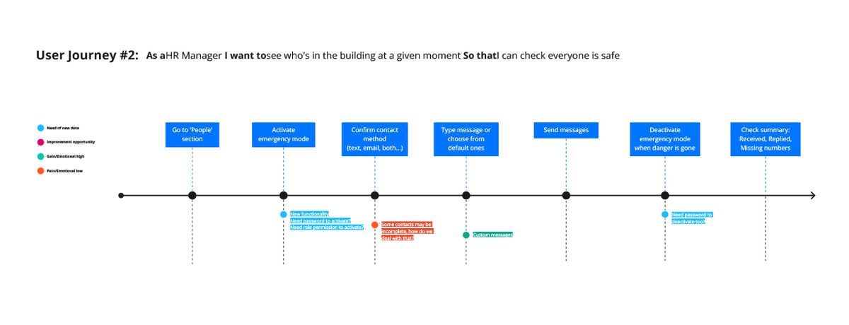
Role-based personas and user journeys were developed for the most critical user types — each mapping specific pain points, gains, and opportunities relevant to that role. This ensured the design decisions were grounded in real workflows rather than assumptions, and gave the team a shared reference point for prioritising features and flows.
Challenge
Securing stakeholder buy-in on a limited budget
Solution
A component-based approach was adopted from the start — building a small set of reusable, visually solid UI components that could be assembled quickly into prototypes. This kept production time low while delivering something tangible enough to demonstrate real progress, ultimately securing the continued support and investment the project needed to move forward.
Audit first, design second
The process started not with screens but with a thorough audit of what already existed — mapping the functional flow, identifying structural issues, and understanding the data landscape across three separate systems.
From there, information architecture was restructured, role-based user journeys were defined, and a reusable component library was built to underpin all subsequent UI design.
Prototypes were produced iteratively to validate ideas and communicate progress to stakeholders, keeping the project moving efficiently within a constrained budget.
- Functional flow and sitemap audit — identifying inconsistencies and structural gaps in the existing product
- Data architecture mapping — consolidating three sources of employee information into a structured, usable model
- User journey mapping — role-based journeys covering key personas across departments
Pictured below is the diagram from the application when I arrived.

Sketch
UI and component library

Principle
Lean, reusable UI components built for speed and stakeholder presentations
A product ready to grow from
What started as a developer-built tool with significant gaps was handed back as a design-led product with clear structure, defined user journeys, and a UI foundation the internal team could continue building from.
- Full system audit delivered — functional flow, sitemap, and usability issues documented and resolved
- Data architecture consolidated — three separate sources of employee information mapped, structured, and rationalised into a single coherent model
- Role-based user journeys defined — covering the most critical personas across departments, with pain points and opportunities identified
- Component library built — a reusable, visually credible set of UI components designed to stretch the budget and accelerate delivery
- Stakeholder buy-in secured — prototypes used successfully to convince decision-makers to continue investing in the initiative
- Full handover delivered — UX documentation and screen designs left with the internal team ready for continued development